Distinctive brand assets: why meaning-free beats meaningful (B2B edition)
TL;DR
A distinctive brand asset is a colour, shape, face, sound, or phrase that your buyers recognise as yours, fast, even when the logo is hidden. The ones that work hardest tend to be meaning-free. They don’t explain what you do. They just get remembered.
Most B2B brands do the opposite. They pick a logo that “represents” the product, a colour that “feels trustworthy”, a tagline that “communicates value”. The result tastes like lukewarm water. Invisible to the brain.
If you’re a B2B tech company in a crowded category, your biggest brand risk isn’t being weird. It’s being forgettable.
The scalpel logo
Years ago I ran a marketing agency called Slices. Clever, right? Slice and dice the data, help e-commerce brands personalise their communication. I designed a scalpel logo. Orange type on a navy background.
It tasted like nothing.
I thought the logo was meaningful. It “represented” what I did. I was wrong about the whole premise.
Psychophysicist Mark Changizi explains that water tastes like “nothing” because our brains are wired to perceive it that way. Any hint of a different taste could signal danger, so our brains default to neutral. Survival instinct.
Your branding works the same way. If it looks, feels, and tastes like everything else in your category, people’s brains don’t even register it. Slices didn’t register. It blended in with every other agency that had a “sharp” visual metaphor.
The brands that get remembered do something counterintuitive. They pick assets that don’t obviously mean anything about the job they do, and they repeat them until those assets become the brand.
What is a distinctive brand asset?
A distinctive brand asset is any branding element your buyers can identify as yours without seeing the logo. A colour. A shape. A character. A sound. A phrase.
In Chapter 11 of Stand The F*ck Out (“The Assets”), I call them “the distinctive bits and bobs that make your brand uniquely yours.”
Byron Sharp’s team at the Ehrenberg-Bass Institute, the people behind How Brands Grow, define them as the non-brand-name elements that trigger brand recognition in buyers’ minds. Jenni Romaniuk extended the work in How Brands Grow (Part 2) with a palette of five asset types most brands should build deliberately. I used that exact palette to audit 100 B2B brands, scoring each one asset by asset.
“Assets are the distinctive bits and bobs that make your brand uniquely yours. Could be a colour, shape, sound, word, or even a mascot. The goal? Create meaning-free brand assets that tickle different parts of the brain.” Stand The F*ck Out, Chapter 11
The key word is distinctive, not differentiating, and not meaningful. Those three get mixed up constantly.
Distinctive vs differentiating vs meaningful
| Term | What it does | Example | Who should care |
|---|---|---|---|
| Meaningful branding | Tries to explain or symbolise what the product does | A scalpel logo for a data agency called Slices | Almost nobody. It competes with other meanings already in people’s heads |
| Differentiating branding | Communicates why you’re different from alternatives | ”The privacy-first Google Analytics alternative” | Useful for positioning, not memory |
| Distinctive branding | Gets recognised as yours, fast, regardless of meaning | Gong’s Bruno the Bulldog. PostHog’s hedgehogs. | Any B2B brand in a crowded category |
Distinctive is the one that compounds. Meaningful tends to get drowned by competing associations. Differentiating lives in your copy, not your buyers’ memory.
You want all three eventually. You build distinctive first.
Why meaningful B2B branding fails
Chasing meaning in branding backfires for three specific reasons, and each one hits harder in B2B than people realise.
1. Meaning clogs the brain
If your logo is a sharp line because you’re “sharp”, you now compete in buyers’ minds with every other sharp thing they know. Scalpels. Knives. Arrows. Graphs going up.
Byron Sharp’s research is blunt on this: brands need to own mental shortcuts, not fight for them. A meaning-free asset owns a shortcut clean. A meaning-loaded asset rents one.
2. You become a copycat
Every HR tech company picks blue and a handshake. Every cyber brand picks black and a shield. Every analytics tool picks a line graph.
If you chase the same meaning as your alternatives, you arrive at the same exact point. Looking like a cheap imitation of the category leader.
3. Meaning goes stale
Trend-driven branding ages faster than category-conventional branding. The crypto-futurist gradients that peaked in 2021 now look like a startup that ran out of ideas. Meaning-free assets tend to age better because they were never trying to signal a moment to begin with.
There’s a deeper problem underneath all three. In B2B, buyers evaluate fewer brands than you think. Research from 6sense and others suggests the typical B2B shortlist has dropped from roughly 6 vendors to 3.5. Nine out of ten buyers choose a vendor already on that list when they start.
That shortlist isn’t built during the active buying window. It’s built before buyers even know they’re buying, through repeated exposure to a brand whose assets they can identify without thinking. Meaningful logos don’t get into that shortlist. Memorable ones do.
The 5-element palette
Jenni Romaniuk’s framework, which I use in Chapter 11, is a solid starting point. Pick at least one asset from each row. Build them deliberately. Repeat them everywhere.
| Asset type | What it is | B2B example |
|---|---|---|
| A colour (or combination) | The dominant visible palette your buyer sees on every surface | PostHog’s beige + dark orange |
| A logo or shape | A recurring visual device, not necessarily your company logo | Dark Horse’s forensic strings-and-clippings collage |
| Something with a face | A character, mascot, or spokesperson | Gong’s Bruno the Bulldog. Fibbler’s pink lion. Roger the Rooster for STFO. |
| A sound | A jingle, verbal tic, or accent | My French accent. PostHog’s “squeak”. |
| A short phrase | A catchphrase or signature tagline | ”Bonjour bonjour” for me. “Death to mediocre digital marketing” for Dark Horse. |
Most B2B brands nail colour and logo. They skip the face, the sound, and the phrase because those feel “unprofessional”. That’s exactly where the opportunity sits. Your buyers will remember the bulldog before they remember the log-in screen.
B2B brands that actually did it
Five examples. Each one picked assets that don’t obviously explain what the product does, and repeated them long enough that the brand got lodged.
PostHog: hedgehogs and Windows 98
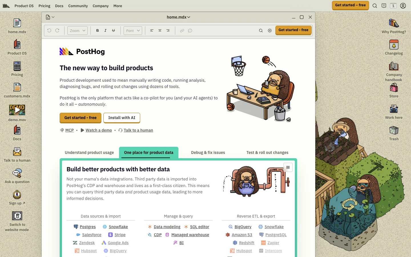
PostHog is a product analytics platform. Developer-first, open-source, competes with Mixpanel and Amplitude.
| Asset type | Typical product analytics | PostHog |
|---|---|---|
| Colour | White, Meta blue, black | Beige, dark orange |
| Logo or shape | Waves, graphs | Windows 98 desktop vibes. Their entire site looks like a retro OS. |
| Face | Stock photos of a team gathered around a laptop | Hedgehogs. Dozens of them. In every illustration. |
| Sound | Silent | A “squeak” |
| Phrase | ”Grow relentlessly" | "Here are some of our paying customers. (Yes they actually use us. No it’s not just some random engineer who tried us out 2+ years ago.)” |
Hedgehogs have nothing to do with analytics. Windows 98 has nothing to do with modern developer tools. That’s the point. The combination makes PostHog immediately identifiable to their audience (engineers) and invisible-but-fine to everyone else.
Gong: Bruno the Bulldog
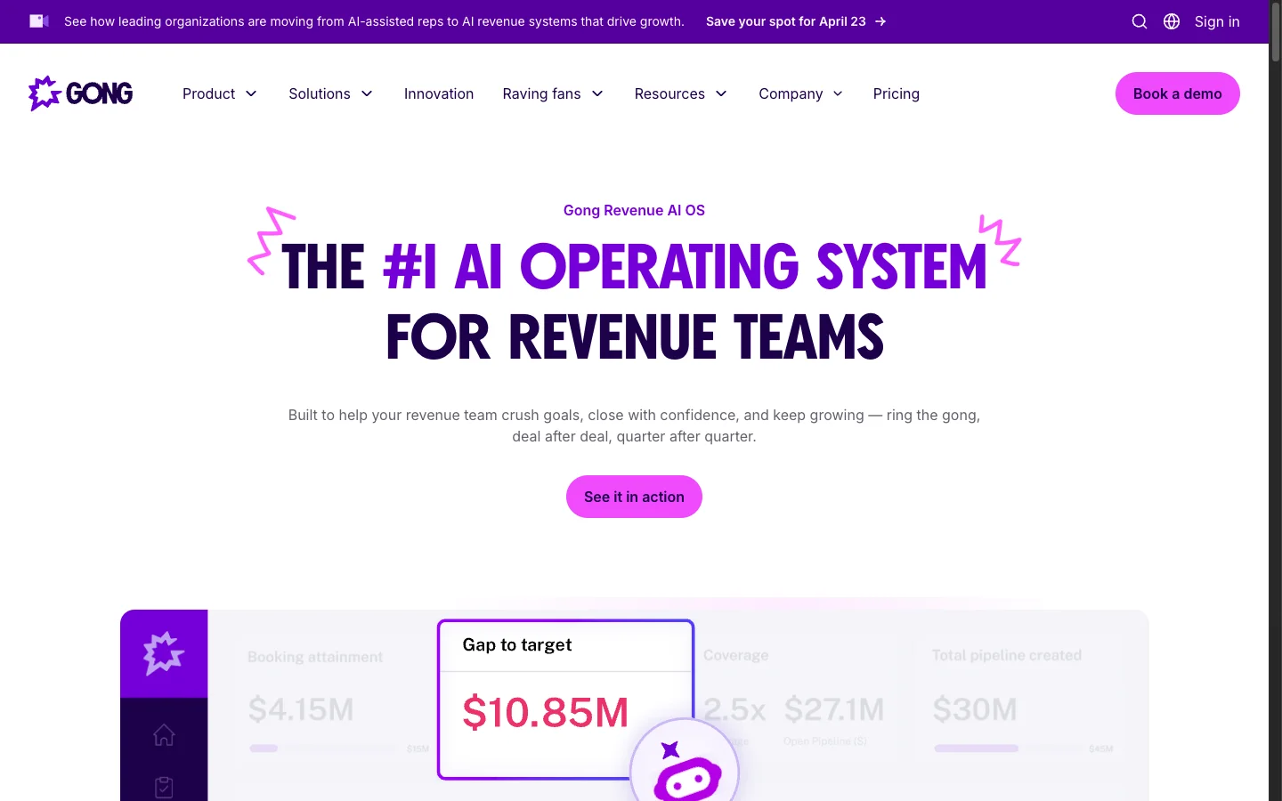
Gong sells revenue intelligence to enterprise sales teams. Competes with Chorus, Salesloft, the big CRM ecosystems.
A bulldog has zero semantic overlap with call-recording software. That’s why it works. They paired Bruno with a purple-and-hot-pink palette, jagged starburst typography, and the “ring the gong” verbal cue, in a category where every competitor uses corporate navy and grey. You remember Bruno before you remember the product feature list, which is the entire goal.
Fibbler: the pink lion getting punched by the CEO
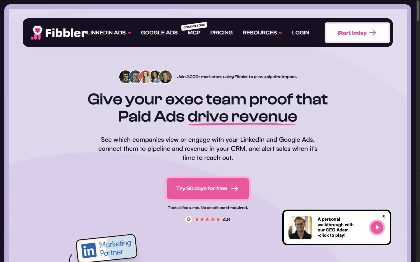
Fibbler is paid-ads attribution software for SMB marketing teams. Competes with the attribution features buried in HubSpot, Dreamdata, and the native LinkedIn/Google Ads reporting.
Their asset? A pink lion. Not explaining anything about attribution. Just a pink lion, on every surface of the brand.
What makes it a case study rather than a cute logo: their founder Adam Holmgren started dropping the pink lion into famous fight memes where the marketer (the lion) gets beat up by the CEO. Will Smith slapping Chris Rock. Zidane’s headbutt. Mayweather in the ring. They ran those as paid ads.
CTR across the four variants on cold traffic: 0.83%, 0.99%, 1.08%, 1.4%.
Adam’s explanation in his own words: “Most B2B ads flatter the marketer. You’re a hero. You’re a rockstar. You’re a growth leader. Our ads do the opposite. They show the marketer getting dunked on by their own CEO. Because that’s what actually happens every Monday morning when the pipeline number goes down. Turns out marketers don’t want to be told they’re heroes. They want to feel seen.”
The pink lion could have been anything. The point is it’s consistent, meaning-free, and it lets the brand weaponise cultural moments without starting from scratch every campaign.
Dark Horse: death to mediocre digital marketing
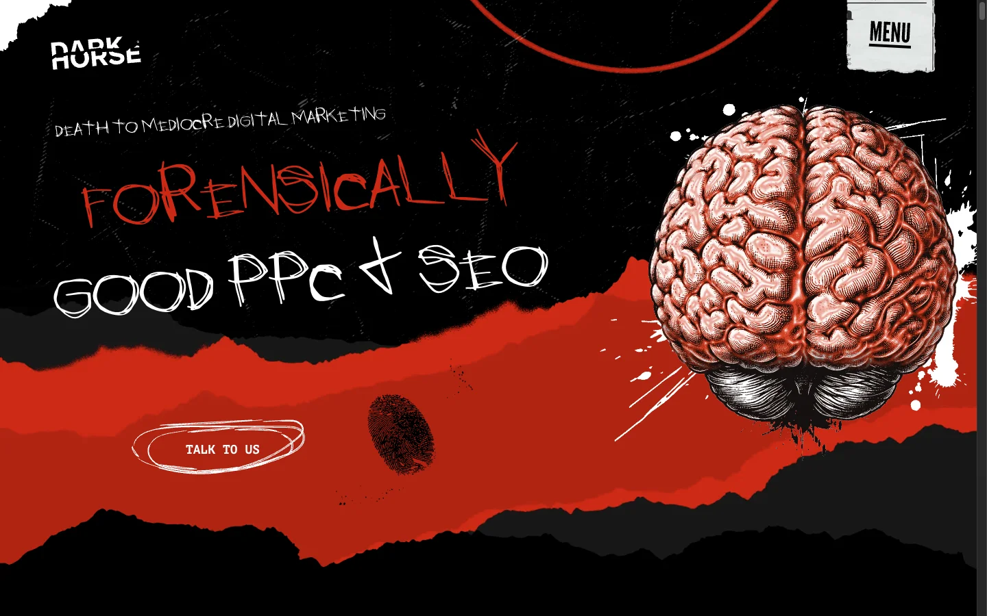
Dark Horse is a PPC and SEO agency based in London. Tiny category, massive competition, and every single competitor uses the same “smiley team photo + 91% ROAS” template.
| Asset type | Typical local ad agency | Dark Horse |
|---|---|---|
| Colour | Blue, white | Monochromatic with a dash of red |
| Logo or shape | Lots of logos | Photos, newspaper clippings, maps. Strings, markers, handwritten notes. Forensic-investigation aesthetic. |
| Face | Team members round a laptop | Ghosts. Skulls. Dodgy horror-movie characters. |
| Phrase | ”91.74% increase in ROAS" | "We help aspiring e-commerce companies parade the bodies of their competition while swimming in money, through PPC, paid social, and SEO.” |
Would every agency get away with “parade the bodies of their competition”? No. That’s the point. Dark Horse’s assets are meaning-free for their category, and visceral enough that you remember them after one exposure.
STFO: Roger the Rooster and “Bonjour bonjour”
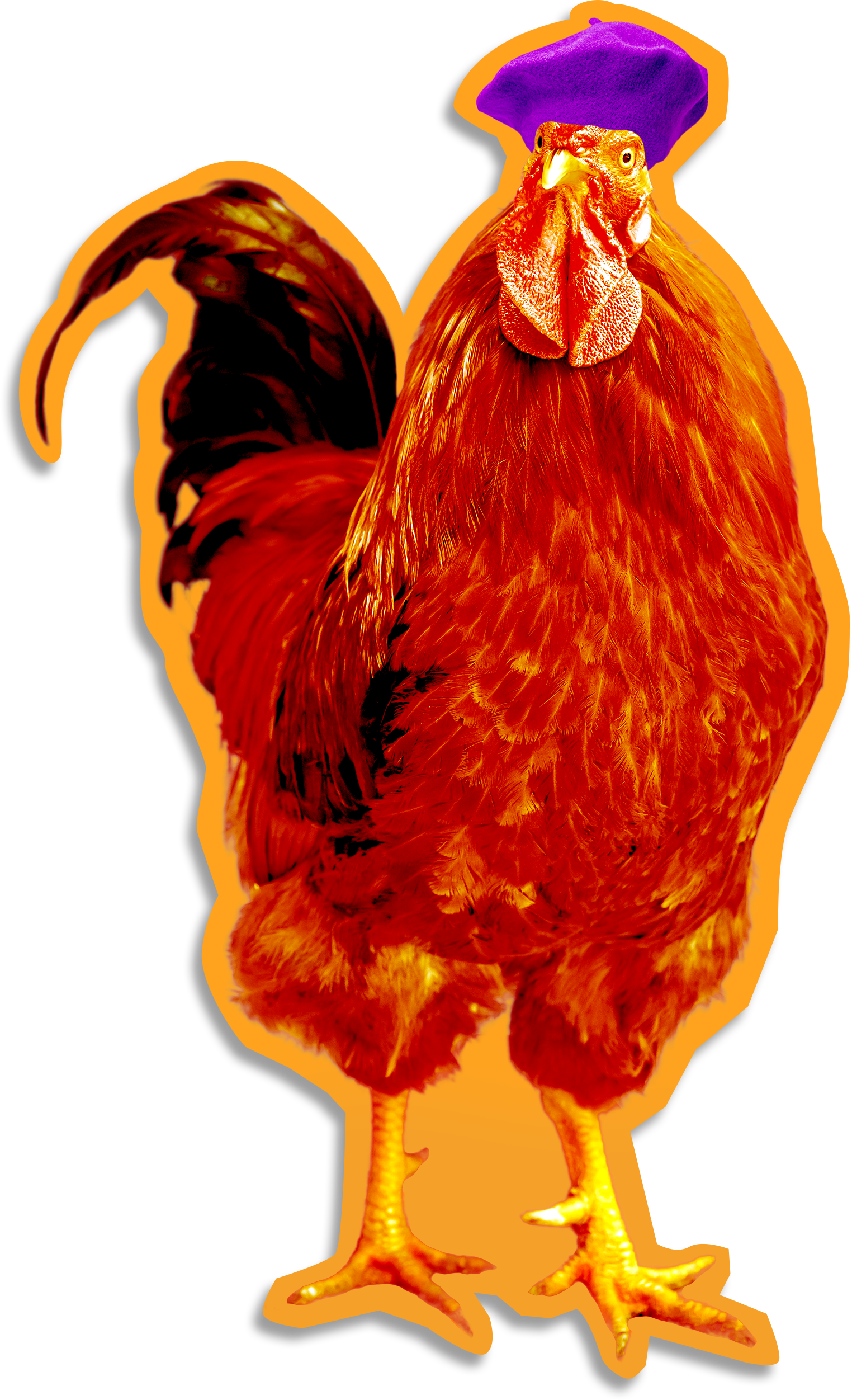
Can’t write this piece without putting my own brand on the stand.
| Asset type | STFO |
|---|---|
| Colour | Black, orange, purple. A bit flashy for the B2B positioning category. |
| Logo or shape | Sticker-style graphics, mimicking the look of actual stickers |
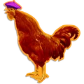
| Face | Roger the Rooster, my French rooster with a purple béret and questionable fashion sense. Not fully meaning-free (French rooster = my nationality), but unlikely anyone else in B2B positioning will use it. |
| Sound | My French accent. I used to hate it. Then I realised others noticed it. So I doubled down. |
| Phrase | ”Bonjour bonjour” and “Stand The F*ck Out”. |
I didn’t plan all of this upfront. Bonjour bonjour was an accident. The accent was a liability I inverted. Roger was deliberate, though, and he’s the single asset people message me about the most. Not the book. Not the podcast. A rooster with a béret.
That’s distinctiveness doing its job.
Common mistakes B2B teams make
- Picking assets that “represent” what you do. Fountain pens for copywriters. Graphs for analytics tools. Handshakes for HR tech. Instant invisibility.
- Rebranding every two years because the team is bored. Your buyers aren’t bored. They’re barely paying attention. Resetting the clock wastes the memory you’ve already built.
- Refusing to commit to a face. “We don’t want a mascot” is one of the most expensive opinions in B2B. The bulldog/hedgehog/rooster tax is real.
- Using assets inconsistently. If the website uses the mascot and the sales deck doesn’t, you’re splitting the memory trace in half. Every touchpoint needs the same kit.
- Testing distinctive assets in a Google Doc. You can’t focus-group a distinctive brand asset into existence. You ship it, you repeat it, you measure recall over time.
- Optimising for “professional” instead of memorable. The professional asset is the invisible one. If your branding could be swapped with a competitor’s and nobody would notice, that’s the finding.
FAQ
What is a distinctive brand asset?
A distinctive brand asset is any non-brand-name element, a colour, shape, face, sound, or phrase, that buyers recognise as yours. The term comes from Byron Sharp and Jenni Romaniuk’s work at the Ehrenberg-Bass Institute. The test is simple: cover the logo, show the asset, and see if your buyers still know it’s you.
What are the types of distinctive brand assets?
There are five practical types, drawn from Jenni Romaniuk’s How Brands Grow (Part 2): a colour (or colour combination), a logo or shape, something with a face (character or spokesperson), a sound, and a short phrase. Most B2B brands only invest in the first two. The ones that stand out invest in all five.
How do I test whether a brand asset is distinctive?
Show the asset to your buyers without the brand name attached, and measure two things. Fame: what percentage of your target segment identifies the brand correctly? Uniqueness: what percentage link the asset to your brand and only your brand? The goal is high on both. Jenni Romaniuk calls this the “distinctive asset grid”, and it’s the closest thing the field has to a standard measurement.
What did Byron Sharp say about distinctive brand assets?
Byron Sharp, in How Brands Grow, argues that brands grow through mental availability (buyers thinking of you in a buying situation) and physical availability (you being easy to find). Distinctive brand assets are the building blocks of mental availability. Sharp’s team at Ehrenberg-Bass treat them as a separate asset class from differentiation or positioning. Distinctive assets aren’t about why buyers should pick you. They’re about whether buyers can recall you at all.
What’s the difference between distinctive and differentiating?
Differentiating branding tries to explain why you’re different from alternatives (“the privacy-first Google Analytics alternative”). Distinctive branding just gets you recognised, fast, with no explanation (“beige and dark orange hedgehogs” = PostHog). You want both eventually. You build distinctive first, because without recognition, nobody’s reading your differentiation copy in the first place.
Does this apply to B2B, or is it only a B2C idea?
It applies more to B2B, not less. B2B buyers evaluate fewer vendors on average (research from 6sense and others suggests the typical shortlist has dropped from around 6 to 3.5), and nine out of ten end up choosing from that shortlist. If you’re not distinctive enough to land on the list months before the buying window opens, you lose before the process starts. Distinctive brand assets are how you earn and defend that slot.
The take
Meaningful branding is comforting because it feels like it makes sense. Meaning-free branding feels uncomfortable, because it doesn’t obviously explain anything.
The second one is probably what gets you remembered.
Your buyers don’t choose a vendor because the logo tells a clever story. They choose the brand they can recall without thinking. That recall is built slowly, by repetition of assets that don’t compete with every other meaning already in their heads.
Pick a colour, a shape, a face, a sound, a phrase. Make them a little weird for your category. Repeat them everywhere, for longer than feels reasonable.
Then keep going.
Related episodes
Key terms
Distinctive Brand Assets
Distinctive brand assets are the meaning-free bits and bobs that make your brand uniquely yours. A colour, shape, sound, mascot, or phrase. The goal is to tickle different parts of the brain without competing with all the other crap floating around in people's heads. Meaningful logos are overrated.
Mental Availability
Mental availability is the probability that a buyer will think of your brand in a buying situation. It is the combined result of distinctive brand assets (Stage 3) and continuous reach (Stage 4). Most B2B companies ignore it because they're too busy chasing the 5% of buyers who are actively looking.
Distinctiveness
Distinctiveness is what makes your brand noticed, remembered, and shortlisted when buyers are ready to act. It is not the same as differentiation. Differentiation gives people a reason to choose you. Distinctiveness gives people a reason to remember you. You need one or the other. Ideally both.