Linear 16/24 Recognisable
Three peaks (logo, colour, UI motif), two verbal anchors, six assets at 2+. The benchmark distinctive brand in this audit cohort.
Linear is the benchmark distinctive brand in this cohort. Six of eight assets score 2 or better, three of them peak. It’s the cleanest scorecard in the study, and it reads as one coherent world rather than a pile of nice details.
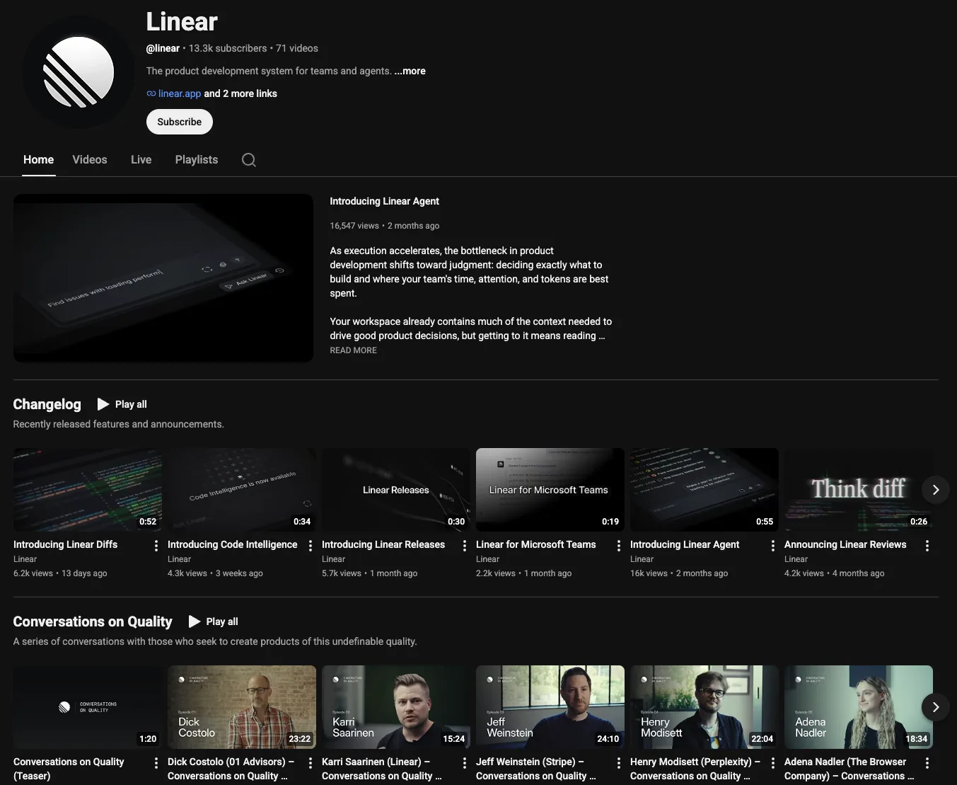
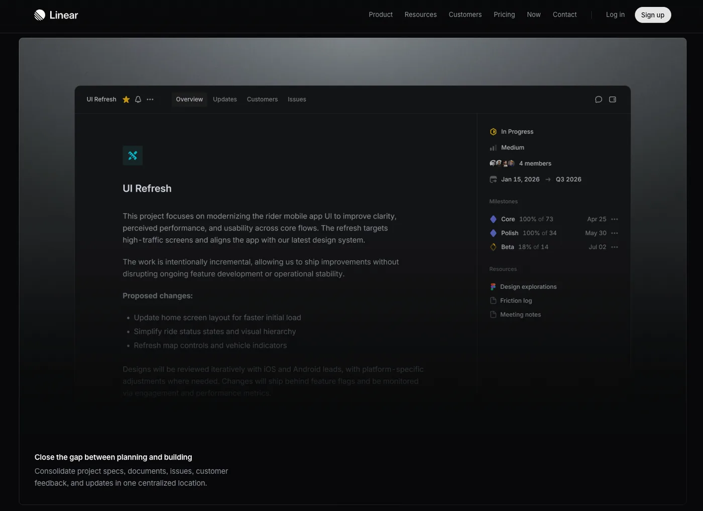
The wireframe-sphere mark, all overlapping orbital arcs, sits on 13 surfaces and no DevTools peer has anything like it. The near-black canvas plus indigo is a named, published palette held with real discipline. And the status-circles-and-command-K UI chrome is the motif competitors actively copy, which is the surest sign you own something.
One gap, and it’s small. Typography sits at 1 because the primary web font is Inter, while the genuinely distinctive display serif on their editorial pages is undocumented. Write that serif into the brand guidelines, pair it with a two-mode spec, and the only weak spot on an otherwise spotless scorecard is gone.
The scorecard
16/24 overall · Recognisable band
The brand, surface by surface
Logo & marks
Website surfaces

Product UI
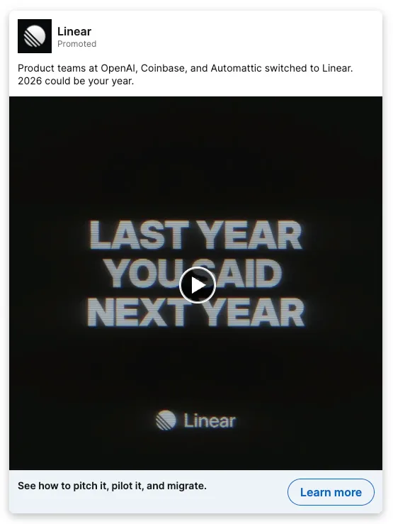
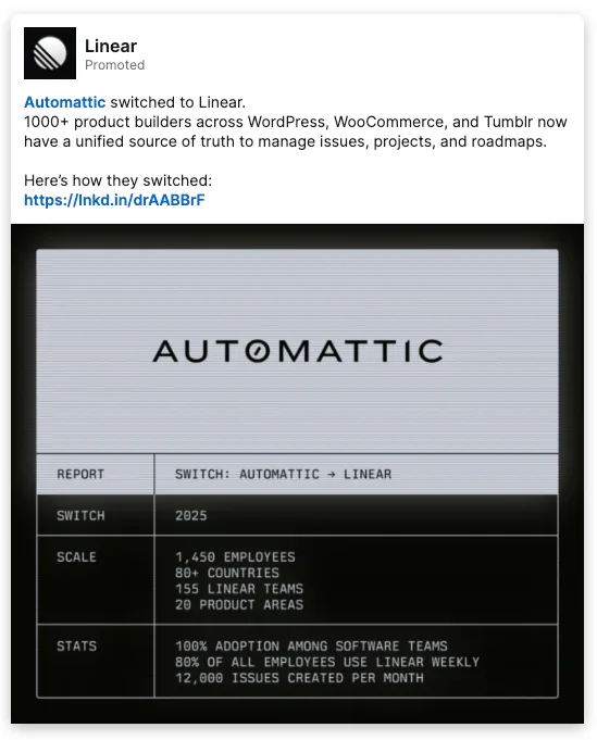
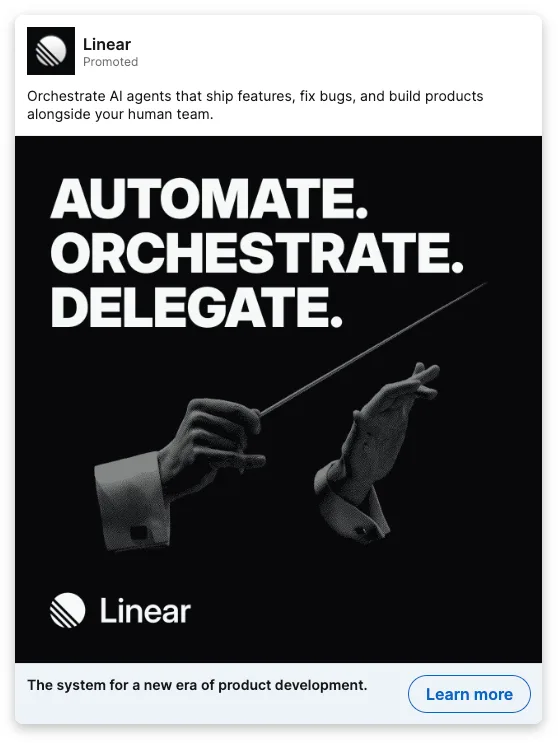
Social & ads
Other