Mutiny 18/24 Recognisable
Raccoon mascot, owned multi-pastel system, and canvas UI — the only non-Linear brand in this audit with both verbal and visual peaks.
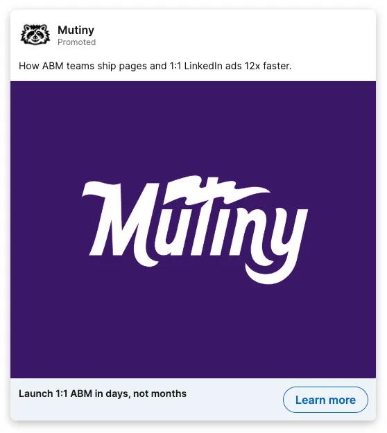
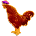
Mutiny is the only company in the whole audit, besides Linear, with both a verbal and a visual peak. The reason is a raccoon. An actual mascot, there to lead a mutiny, in a category where literally nobody else has a character. That alone makes them recognisable on sight.
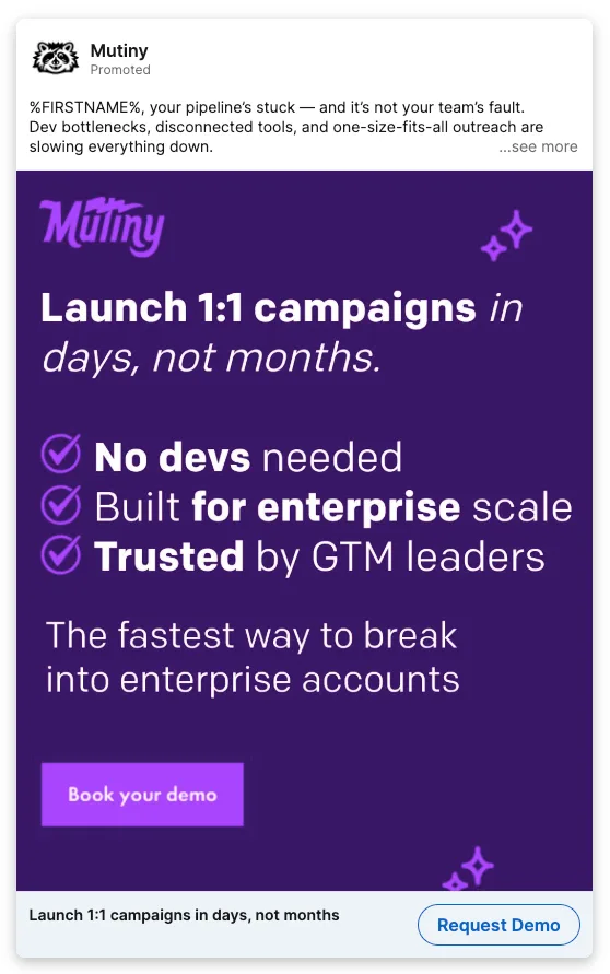
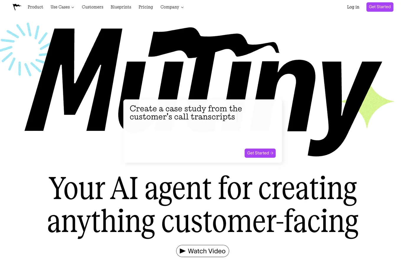
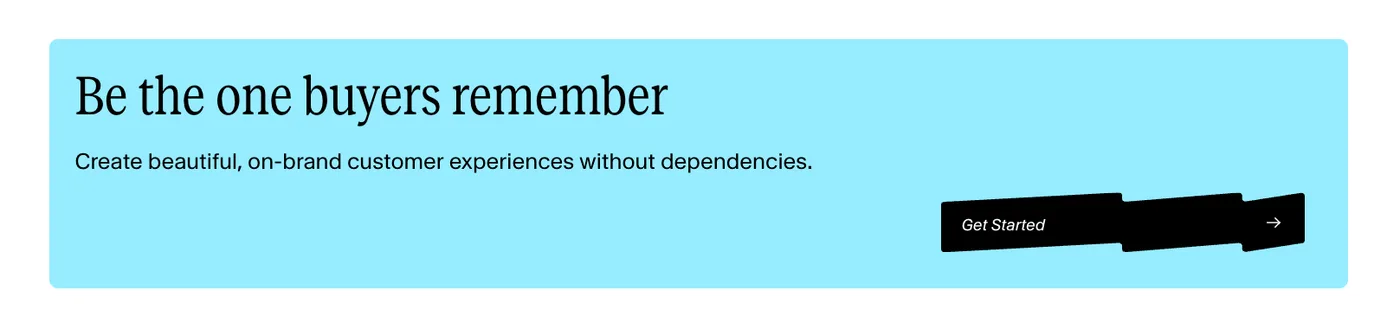
Around the raccoon sits an owned multi-pastel system, mint and lavender and peach and sky, that no competitor runs, plus a consistent set of product-UI card mockups and a tagline that earns the name: “Be the one buyers remember” recurs verbatim across the site. They built a small world and stayed in it.
The catch is that the best asset is hiding. The raccoon lives in the footer at 80px when it should be front-of-site. The flag and pirate motif is underdeployed. Promote the mascot to hero level, give it a name and a POV, and the gap between good and unforgettable closes fast.
The scorecard
18/24 overall · Recognisable band
The brand, surface by surface
Characters & mascots
Website surfaces
Product UI
Social & ads